
Oupsies!
You just fell off the web and landed in Rhea's fluffy corner.
Enjoy it!
Color & Brand Strategist for Sensory Experiences - Copyright @Meg Rouje 2026
Page in progress!

No cohesive visual library
You're piecing together random photos from different shoots, different years, different vibes. Nothing feels like it belongs together.

Unclear brand direction
You know you need professional photos, but you don't know what to wear, where to shoot, or how to make sure it all aligns with your brand.

No time to figure it out
You're running a business. You don't have hours to spend on Pinterest boards and location scouting.
Need credibility, not just "pretty"
You need images that make potential clients, partners, or media immediately take you seriously.
Here's How We Fix That....
A strategic process,
not just a photoshoot
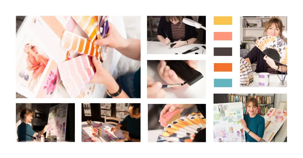
STEP 1: Color & Brand Strategy Session (30 min)
We start with a brand audit and strategy call. I ask about your business, your ideal clients, your values — then we translate that into a visual plan: your color palette, outfit direction, location vibe, and mood.
You walk away knowing exactly what to wear and what we're creating.
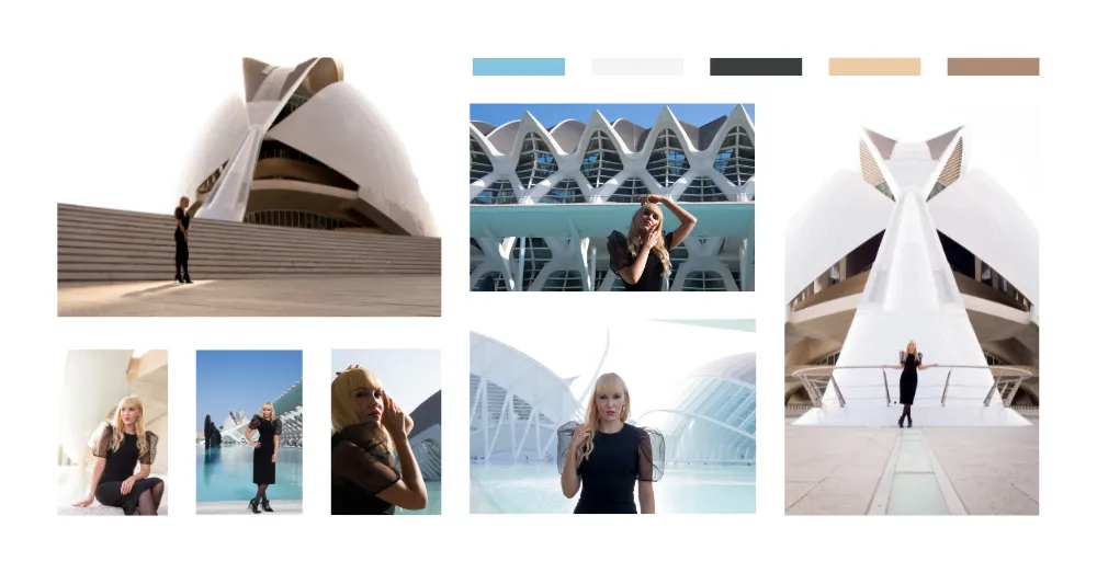
STEP 2: Guided Photoshoot (1 hour or full day)
I direct everything: poses, angles, lighting, and composition. You don't need to "know how to pose" — I guide you through it so you look natural, confident, and like yourself on your best day.
We shoot in locations that match your brand energy (urban, natural, architectural, studio — whatever reinforces your message).
STEP 3: Curated Gallery & Final Delivery
You receive an online gallery of professionally edited images. Pick your favorites based on how you'll use them: website hero, LinkedIn header, About page, social content, client proposals.
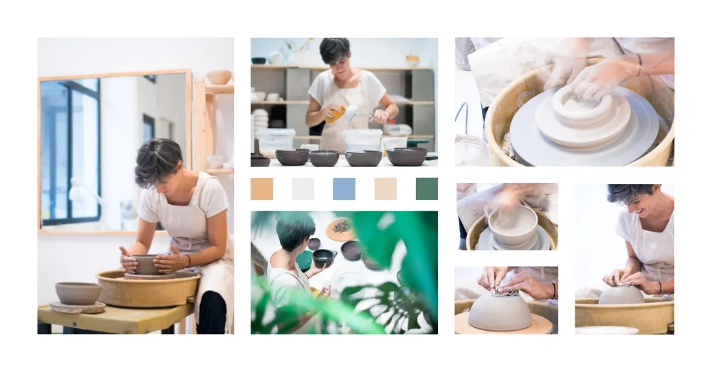
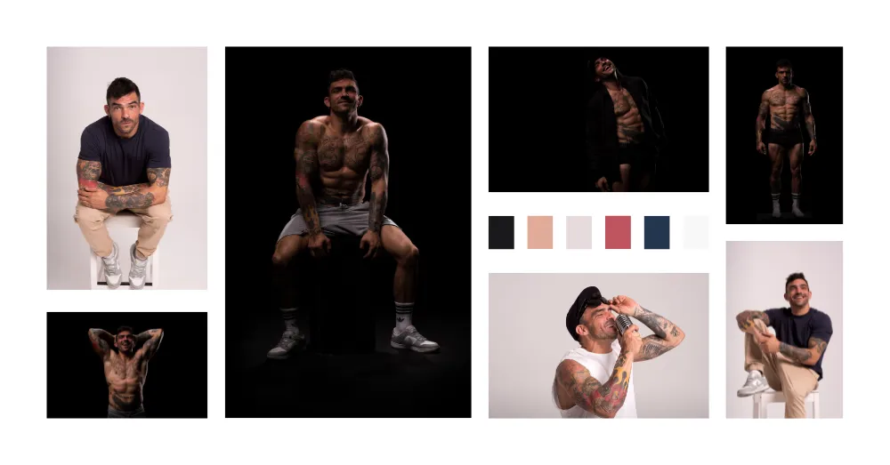
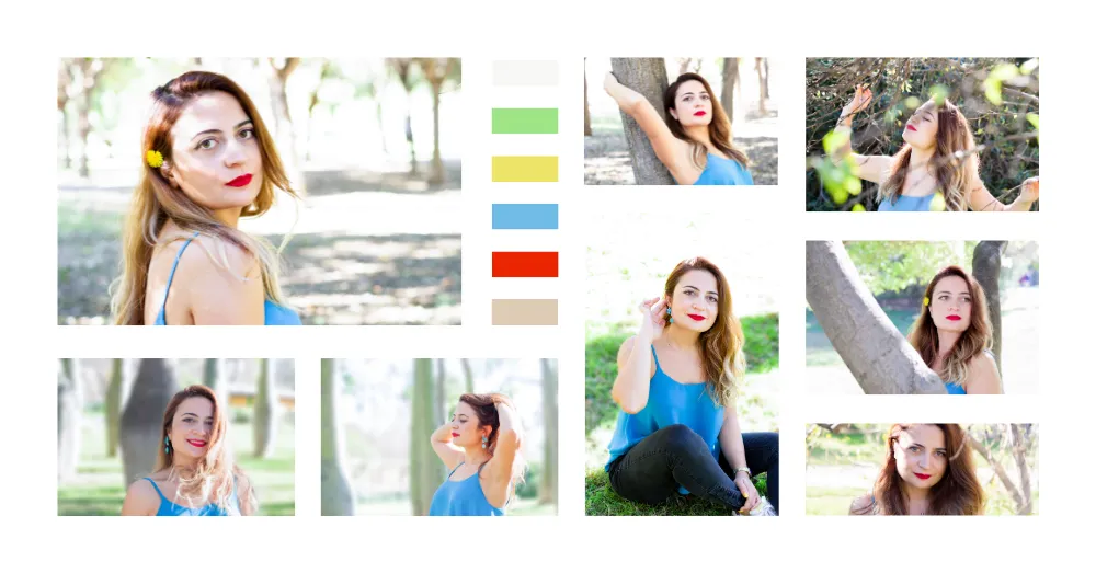
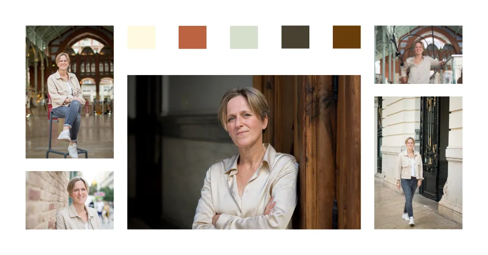
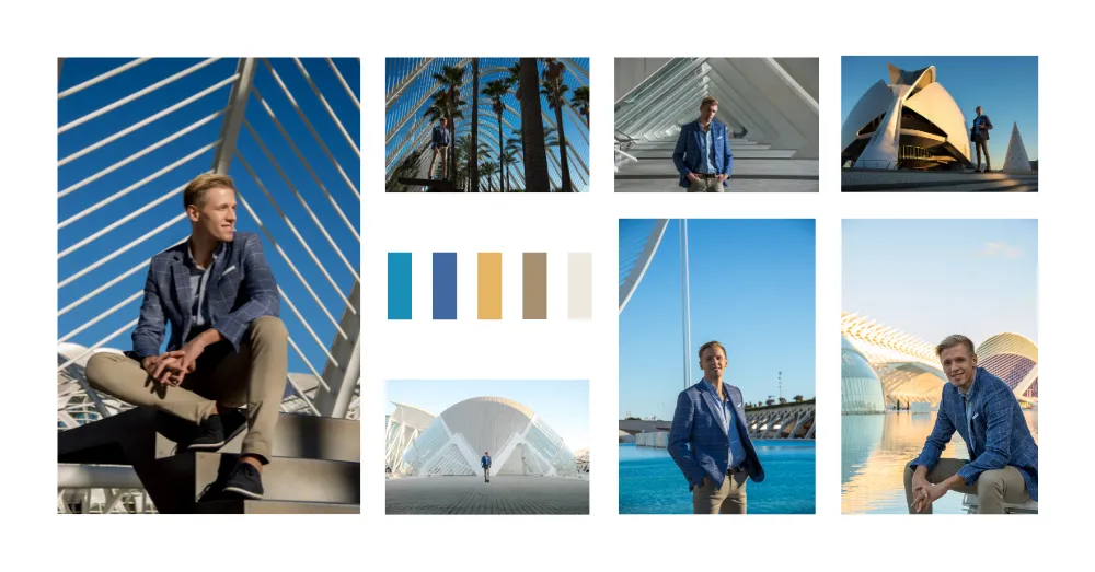
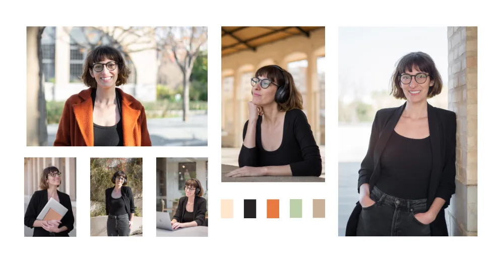
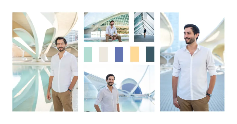
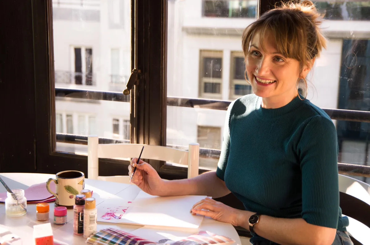
Headshots & Environemental Shots
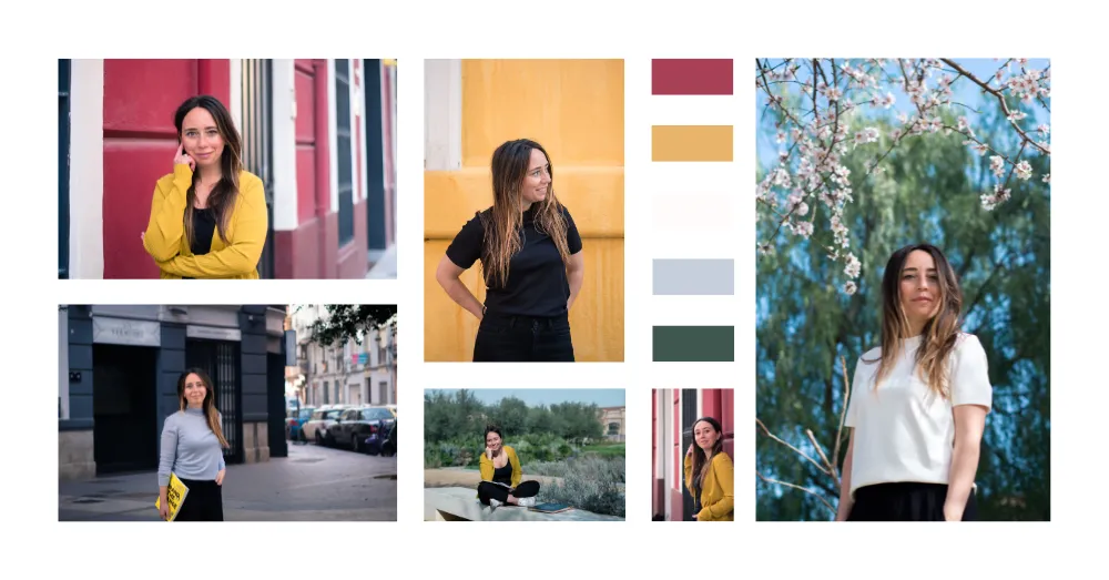
You want:
• To build trust with strategic visuals that communicate your authority, not just "nice photos"
• To increase credibility by maintaining cohesive branding throughout, not scattered pieces of a puzzle
• To appear professional, natural, and confident, not like you're trying too hard
• To convey your personality and values, not get generic business headshots
You need someone who actually understands how color, light, and composition communicate trust.
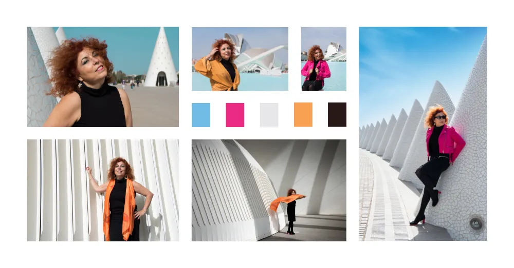
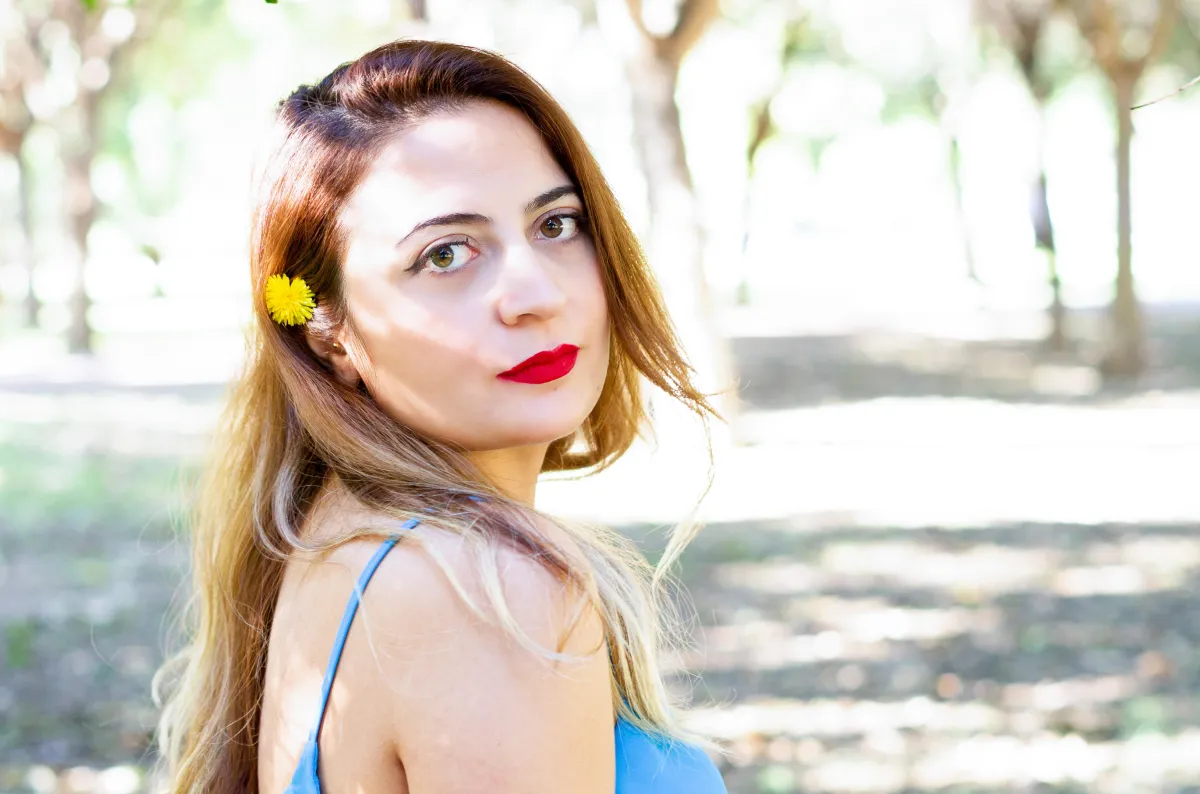
Lifestyle & Brand Storytelling
My Packages
Pick the package that matches where your business is right now.
The
Brand Refresh
Simple, professional, strategic.
Best for: Consultants, coaches, and creatives who need to refresh their visual foundation without overthinking it.
What's included:
• Brand audit questionnaire
• 30-mins brand strategy call (colors, outfits, mood, location)
• 1-hour guided photoshoot
• 12 professionally edited photos
• Online gallery for selection
• Color-matched editing to your brand palette
Starts at €340 + IVA
The Brand Partnership
A creative partnership that grows with you.
Best for: Entrepreneurs and creators who want fresh content throughout the year and a trusted creative partner.
What's included:
• Everything from The Brand Refresh
• 3 photoshoots per year (quarterly)
• 12 edited photos per session (36 total/year)
• Priority booking
• Ongoing color strategy as your brand evolves
€70/month + IVA (12-month commitment)
The Brand
Glow-Up
The complete brand transformation.
Best for: Authors, speakers, and business owners stepping into high-visibility roles (book launches, media features, thought leadership).
What's included:
• Brand audit & 30-minute strategy call
• Full archetype analysis & visual moodboard
• Full-day photoshoot (studio + natural light locations)
• Professional hair & makeup
• Styling guidance
• 40 professionally edited photos
• Lunch included
Starts at €2,000 + IVA
Have questions?
Frequently Asked Questions
Do I need to have my brand colors figured out before we work together?
Nope. If you already have brand guidelines, we'll translate them into photography. If you're still figuring it out, we'll define your color palette together during the strategy session.
What if I hate being photographed?
Most of my clients say the same thing before we shoot. I guide you through every pose and angle — you don't need to "know what to do." My job is to make you look natural and confident, not stiff or forced.
How long until I get my photos?
You'll receive your online gallery within 2 weeks of the shoot. From there, you pick your favorites, and I deliver the final edited images within 14 days.
Can I add more photos later?
Yes. You can purchase additional edited photos from your gallery at €30 per image. You'll find all the T&C's in the contract.
Where do we shoot?
Depends on your brand vibe. We discuss location during the strategy call — could be urban Valencia (modern/architectural), natural outdoor settings (warm/approachable), or studio (clean/polished). I handle all location scouting.
What should I wear?
I'll give you specific outfit guidance during our strategy call based on your brand colors and the vibe we're going for. If you need help shopping, I can recommend specific pieces.
Do you travel outside Valencia?
For The Brand Glow-Up package, yes — travel fees apply. For The Brand Refresh and Partnership, I work primarily in Valencia.
Ready to build a visual identity that actually works?
Book a free 15-minute discovery call and we'll figure out which package fits your business.