
Page in Progress...
Interested in using color strategically in your business or training your team?
Color Strategy Workshops for
Creative & Marketing Teams
What if "blue means trust"
is costing you brand recognition?
ClearPath
FINANCIAL
SecureFuture
INSURANCE
TrustPoint
CAPITAL
Heritage
WEALTH
BlueStone
ADVISORS
Summit
FINANCIAL GROUP
NorthBridge
INVESTMENTS
Harborview
WEALTH MANAGEMENT
Pinnacle
FINANCIAL PARTNERS
Most teams choose colors based on what they've been told color means.
The problem?
Everyone has been told the same thing.
A different way to experience color.
A new way to use it strategically.
When color becomes strategy—not decoration, not trend—your brand gains something most brands never have:
A coherent sensory experience people feel, remember, and recognize.
Before they read a single word.
Everything You Were Taught About Color is... Only Half True
There are a handful of beliefs about color that have been repeated so often they've become industry gospel.
Most of them are incomplete.
Some of them are actively working against your brand.
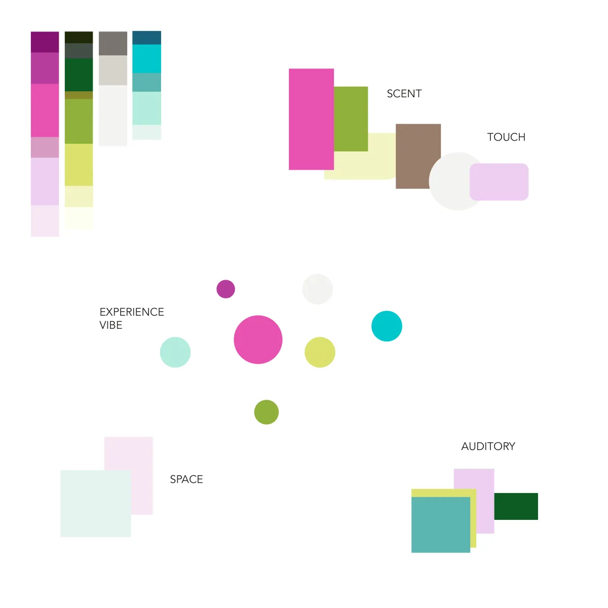
Color makes a brand memorable and recognizable.
Memory is built on emotions and meaning.
Memory is formed through emotional intensity. Color only becomes memorable when it’s part of a meaningful emotional experience the brain actually feels, not just sees.
Color is just a visual or aesthetic tool.
Color is a biological signal.
Color is light entering the body through the eyes and skin. It influences the nervous system, hormonal activity, and mental state, shaping how we feel and behave.
Brand recognition comes from consistency in color use.
Brand recognition comes from consistent emotional imprint.
Recognition comes from coherence in emotional imprint. A consistent feeling matters more than a consistent hex code. The nervous system remembers states, not hex codes.
We need to stick to our hex codes everywhere.
Your hex codes need to be flexible.
Color perception is contextual and multisensory. Surroundings, texture, light, and mood can shift how a color is perceived. Different environments and contexts need different color usage because the priority is the emotional experience you create. Color should support that.
We should follow industry standards.
Color is a powerful signal. Use it wisely.
Branding exists to create distinction. Following standard color systems means looking like your competitors and becoming one of many.
Color is felt before it's seen.
Understood before it's verbalized.
And remembered only when it means something.
Red ≠ Passion
Color meaning isn't universal.
Several factors change its meaning.
Light impacts our hormones, affecting sleep, mood, behavior, and perception.
Patterns we created through time and recognize before any conscious meaning.
Subconscious ideas we connect with colors — blue = sky = spacious, yellow = sun = warm.
Our environment, social habits, beliefs, and resources affect how we see color.
Our relationship with color is shaped by marketing, society, and trends.
Our experiences affect how we interpret color.
A red wall, object, food, or light each impact perception differently.
Different materials, surfaces, and usage change color meaning.
A shift in saturation changes subconscious associations and emotional impact.
Taste, smell, touch, and sound all shape color meaning.
When Color Becomes Strategy
A few changes happen quickly:
01
Faster, more confident decisions
No more "does this feel right?" debates. Your team develops a shared framework for color choices that everyone—creatives, strategists, leadership—can actually use. Less second-guessing. Faster execution. Fewer revision rounds.
02
Stronger brand coherence
When your team understands why a color choice works—not just that it looks good—your brand stays intentional and consistent across every touchpoint: campaigns, spaces, materials, digital, physical. It doesn't unravel in execution.
03
Genuine differentiation
When you stop borrowing from industry color conventions and start building from your brand's actual psychological architecture, you stop looking like your competitors—even when you're in the same market.
The Science Behind the Experience
Color, form, and sensory input shape emotions—and therefore behavior—before any conscious thought occurs. It's how the brain works.
The ChromaSense framework draws from three areas of research to build something your team can actually apply:
🧠
PERCEPTION & BRAIN SCIENCE
How the brain processes color, form, and sensory input — before any conscious thought occurs. Why some experiences feel coherent and others feel "off."
🔮
JUNGIAN ARCHETYPE PSYCHOLOGY
The 12 brand archetypes as psychological energy systems — not surface labels. How they connect to color, tone, and the subconscious patterns your audience carries.
🎨
CHROMASENSORY PALETTE
How color works as a multisensory signal — affecting taste, sound, temperature, and memory. Designing color systems that work across all senses makes your brand more inclusive and more impactful for everyone.
• IACC Certified Color Consultant
International Association of Color Consultants
• Fine Arts Degree
2013: Thesis on color perception & the anomalous mind
• Master's in Advertising
Applied color and perception in communication
• 15+ years
Researching and applying color strategies in various contexts
The Workshops
The ChromaSense workshops move through perception science, archetype psychology, and sensory exploration using creative challenges, guided visualizations, and collaborative exercises. You discover color through all the senses—which is the only way the brain actually retains it.
You leave with a new way of seeing, a new way of deciding, and a framework your team can keep using long after the workshop ends.
Creative Workshops
Hands-on, immersive sessions built around your team’s specific creative and branding challenges. We use creativity as a tool to rethink how you see problems, build ideas, and shape how your brand actually comes to life.
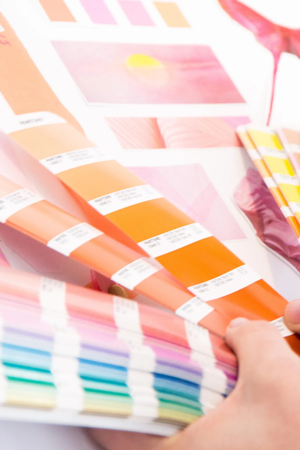
Outdoor
Color Walks
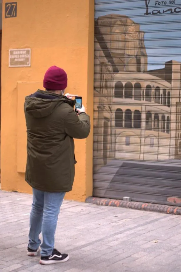
Guided explorations through your city or landscape. You'll notice how color, light, atmosphere, and environment shape mood, memory, and meaning in real time. A more experiential alternative to traditional training—and often where the biggest creative breakthroughs happen.
Who Are These Workshops
Designed For?
For teams that want to go beyond visuals to build a memorable brand experience.
Your team needs a clearer, shared framework for brand and creative decisions
You want faster alignment without endless revision and debate
You're launching something new and need clarity on how it should feel—not just look
You're building experiences across physical spaces, events, or platforms that need to feel coherent everywhere
You want your creative team to think more independently, more intuitively, and with more confidence
Whether you're an in-house creative team, an agency, or a larger organization—if you want your brand to be felt and remembered, not just seen, this is for you.
Built Around Your Team, Your Goals, Your Timeline



Every workshop is a custom creative experience.
Some teams arrive with a specific brief to solve. Others come to reshape how they think entirely.
Some want to move through a city. Others want to go deep in a room.
Whatever works best for your team, we design it.
The way you explain things and share stories really helps me understand in a way that does not happen often. Thank you so much for this!

This is so rich in content that I'm still processing this information. Thanks Meg for this amazing experience and for sharing so much in such a funny and clear way! Love it!

I've never seen anyone talk about branding the way Meg does, it's brilliant! Really opened my eyes to how much more depth and meaning we are able to share!
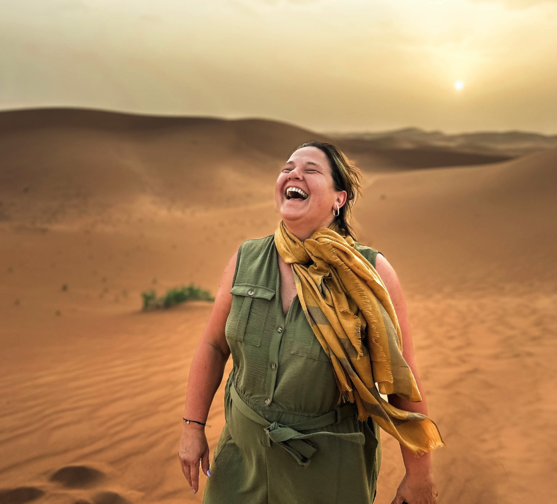
Meg has extensive knowledge and experience when it comes to branding and communication. Her content is incredible! Practical, no fluff, funny, insightful
I recommend Meg Rouje, she has an abundance of knowledge, the process has a lot of depth and yet is presented in a fun way.
Fascinating! I love how you have brilliantly integrated archetype psychology into a super accurate model to help others (myself included) with the misguided idea of branding and what truly entails!
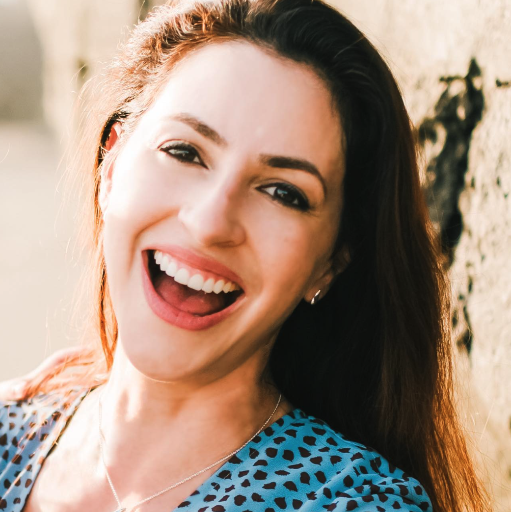

¡Hola!
I'm Meg, an IACC-Certified color consultant with a background in fine arts and advertising.
I have synesthesia: sounds, textures, and sensations appear as colors. About 15+ years ago, I realized not everyone experiences life that way, so I started exploring human perception. Eventually, I developed a system to create more meaningful experiences.
My trainings and book, Colors & Fairy Tales, share that system through the methodology itself.
Ready to change how your team thinks about color?
Color & Brand Strategist for Sensory Experiences - Copyright @Meg Rouje 2026