
From Seen to Felt!
Because your brand is more than just a color palette.
A science-based framework, disguised as a colorful book.
⭐ ⭐ ⭐ ⭐ ⭐
"Wow!! What an amazing journey!
So different, fun, and easy to understand what colors tell us!"
€33 · Digital · Yours to keep and reuse
Brought to you in a playful and practical way by
Nacho Escampignon, the time-traveling langoustine.

⚠️ ⚠️ ⚠️
Fair warning: this book contains a talking langoustine, a Viking village, a Parisian salon, bad coffee, and more Jung references than your average branding book. If you were expecting bullet points and templates, you're in the wrong place. If that sounds good — keep reading.
THE REAL PROBLEM
Most brands start with visuals.
Then they wonder...
Why does every decision about my brand feel like so much work?
Why do I feel like different parts of my brand don't really belong together?
Why does my brand look fine, but not feel impactful or memorable?
Why is it so hard to keep my visuals consistent across platforms, spaces, and materials?
Why does my team or I keep debating what “fits the brand”?
Why does everything take longer than it should when creating content or branding materials?

THE DREAM
What you want instead

Faster, more confident decision-making across the business

A more immersive & coherent brand experience across every touchpoint

Stronger psychological and emotional impact

More efficient teams and smoother execution
WHY IT HAPPENS
Because color is not decoration.
Color is one of the brain's strongest signals — processed before words, before logic, before any conscious decision.
But most brands use it as decoration: something that looks good in a mood board, then falls apart in practice.
What makes a brand memorable isn't how it looks. It's the emotional connection and meaning it creates — consistently, across everything it touches.
To build that kind of experience, color needs to work as part of a larger sensory system — one that shapes how your brand is experienced, remembered, and understood.
That system is what this book teaches you to build.
Step by step. With a langoustine.
Color is not the problem.
The approach is.
WHAT THIS IS
Not a color guide.
Not a branding book.
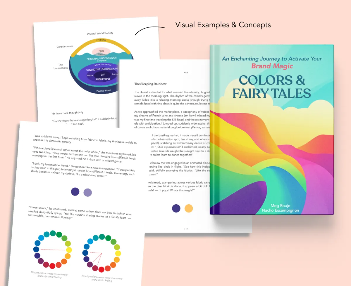
This is a creative experience built around a real framework — rooted in neuroscience, perception psychology, Jungian archetypes, and 15+ years of applied color strategy.
The methodology is structured. The delivery is playful.
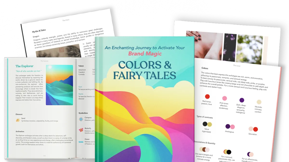
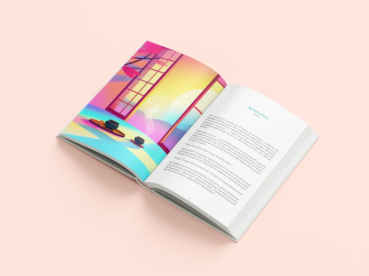
You'll move through stories, immersive exercises, sensory explorations, and 36 archetype-deep dives and moodboards — building a sensory brand direction that you can apply across every touchpoint, not just your Instagram grid.
The goal isn't to finish the book. It's to build something you can actually use — and come back to as your brand evolves.

Meet your guide
Nacho Escampignon,
time-traveling langoustine
Nacho is not a metaphor. He's a character — opinionated, bow-tied, and inexplicably well-connected across centuries. He has argued color theory with Kandinsky, discussed archetypes with Jung (bad coffee), and once spent three weeks hiding in a Parisian croissant basket "for research purposes."
He also nearly became a viral recipe reel. He's still angry about it.
🎨 Debates synesthesia with Kandinsky in 1920s Munich
🧠 Drinks terrible coffee with Jung in the Swiss Alps
🍵 Accidentally disrupts a sacred Japanese tea ceremony
🎶 Introduces the Gipsy Kings to a Norse village. How do you think it went?
THE FOUNDATION
A real system.
The framework draws from perception science, Gestalt psychology, neuroaesthetics, and Jungian archetype theory — not trends, not personal taste. It's the same foundation used in Meg's applied work with brands, spaces, and teams.
🧠
PERCEPTION & BRAIN SCIENCE
How the brain processes color, form, and sensory input — before any conscious thought occurs. Why some experiences feel coherent and others feel "off."
🔮
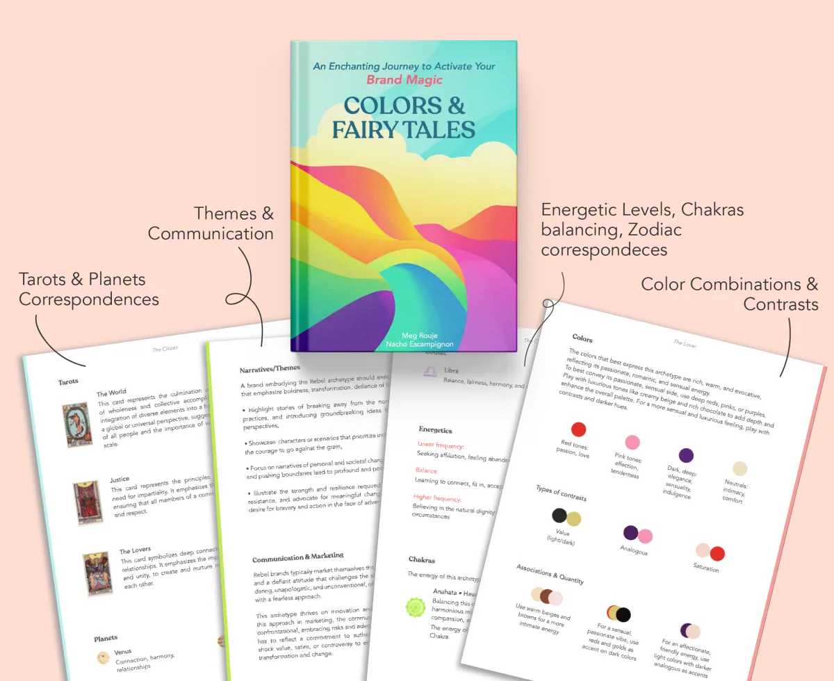
JUNGIAN ARCHETYPE PSYCHOLOGY
The 12 brand archetypes as psychological energy systems — not surface labels. How they connect to color, tone, and the subconscious patterns your audience carries.
🎨
CHROMASENSORY PALETTE
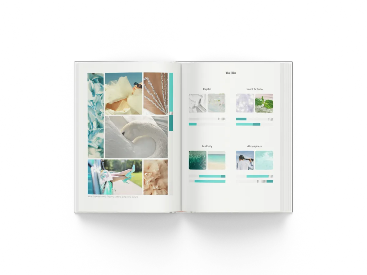
How color works as a multisensory signal — affecting taste, sound, temperature, and memory. Designing color systems that work across all senses makes your brand more inclusive and more impactful for everyone.
• IACC Certified Color Consultant
International Association of Color Consultants
• Fine Arts Degree
2013: Thesis on color perception & the anomalous mind
• Master's in Advertising
Applied color and perception in communication
• 15+ years
Researching and applying color strategies in various contexts
WHAT YOU'LL CREATE
Three things
you'll leave with.
Not a mood board. Not inspiration. A usable direction for your brand experience.
01
A color palette that creates meaning
Built on perception, archetype energy, and emotional intention — not trends or what your competitor is using.
02
A sensory moodboard beyond visuals
A clear direction for how your brand should feel across images, spaces, materials, and communication — online and off.
03
A brand direction you can apply everywhere
Decisions don't start from zero every time. Everything stays aligned as your brand evolves — without needing to call a designer for each choice.

WHAT'S INSIDE
The journey, in layers.
Two sections. Stories and frameworks in the first.
36 archetype moodboards for deep reference in the second.
You move at your own pace.
Section One
A Soulful Journey
Eight chapters, each a "color of the rainbow." Story-led, with practical exercises woven in — brand essence, archetypes, visual language, sensory mapping, brandscape, ChromaSensory palette, and communication strategy.

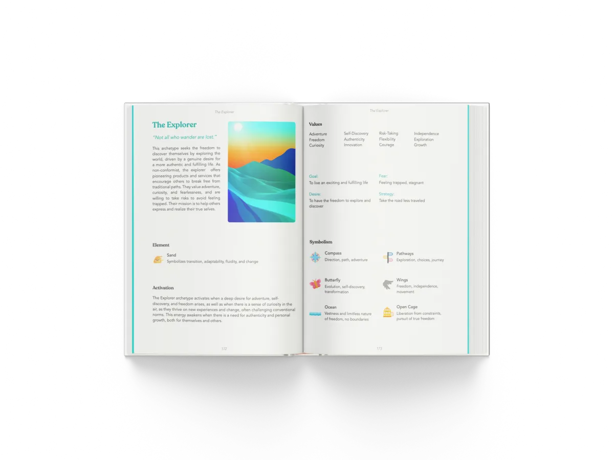
Section two
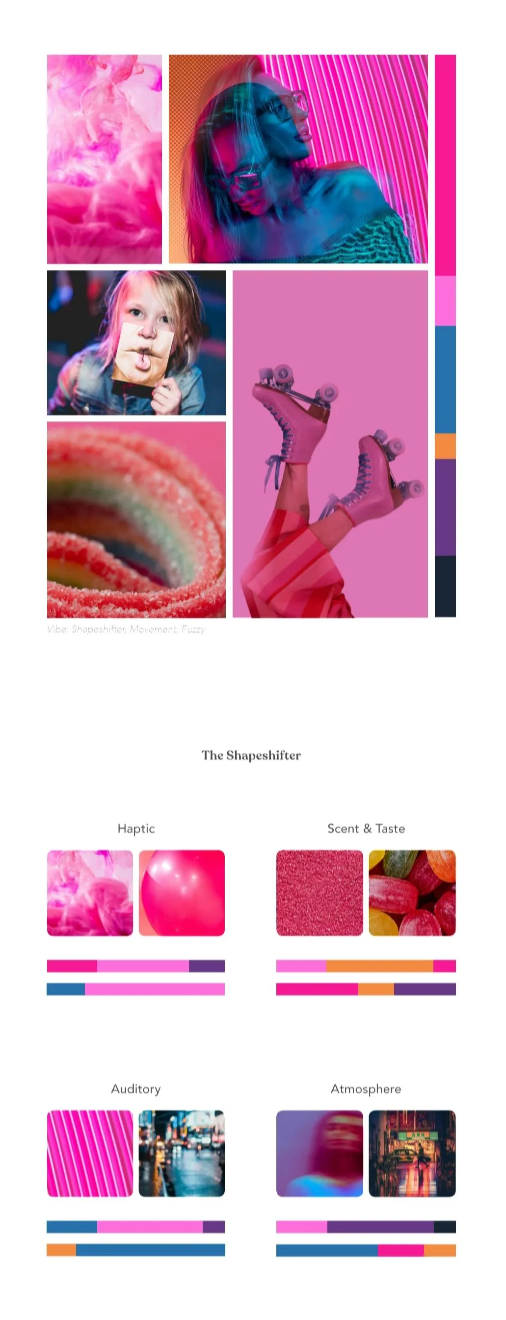
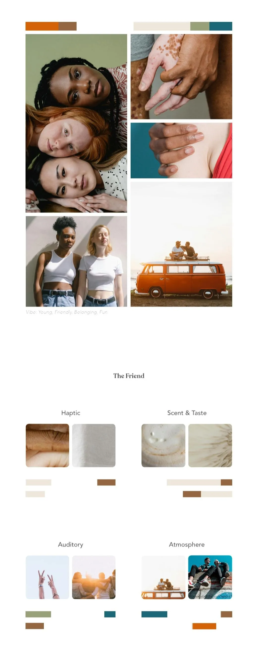
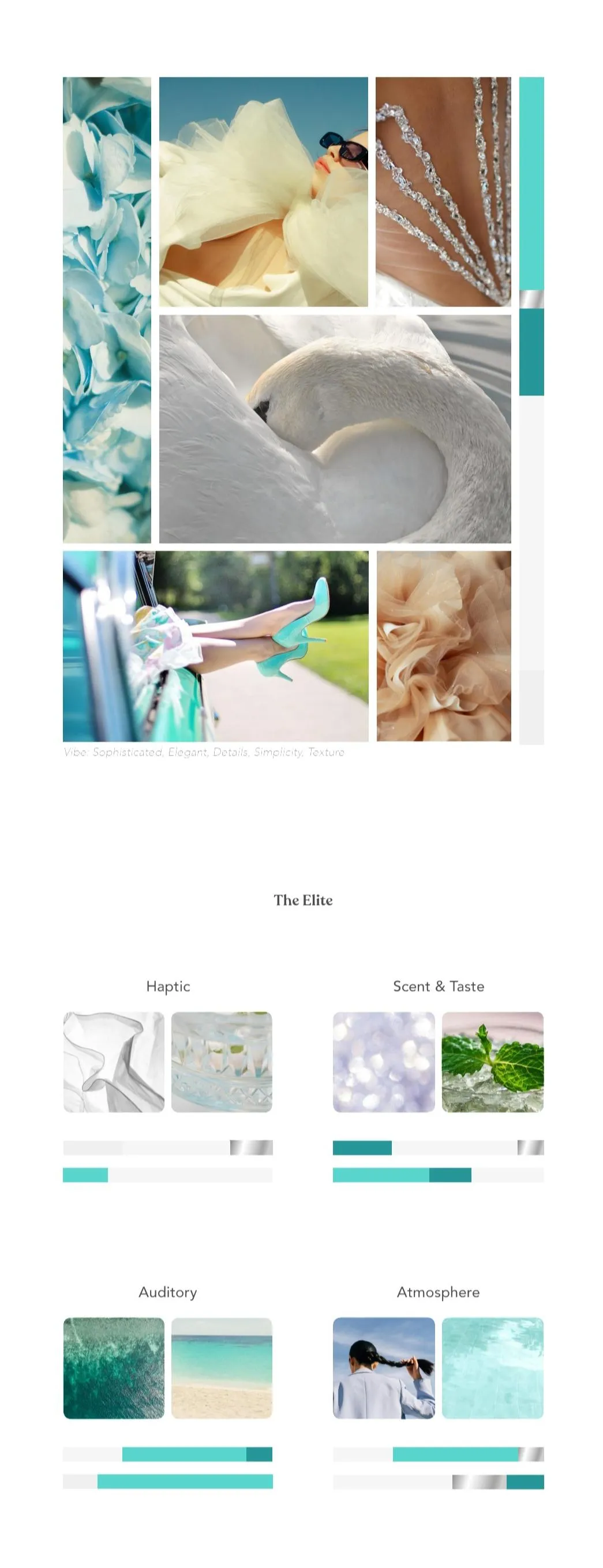
Archetype Deep Dives & Moodboards
Each archetype is explored through symbolism, mythology, and cultural systems, then translated into brand expression—tone of voice, color usage, and marketing applications.
Curated sensory moodboards bring them to life.
Framework
ChromaSensory Palette Method
How to use color not just visually, but as a multisensory signal — and how to calibrate saturation, value, and combinations for the feeling you want to create.
Immersive Design
Built for all types of brains
Interactive exercises, sensory visualizations, illustrated characters, and a layout that doesn't look or feel like any branding book you've opened before.

IS THIS FOR YOU?
Who this is for &
who it isn't.
This book is for you if:

You want to make faster, more confident decisions about your brand without second-guessing every choice
You want your brand to feel consistent across visuals, spaces, materials, and communication, not just on social media
You want to build a brand that exists beyond a screen, and need it to feel coherent in real-world experiences
You're open to learning through story, sensation, and exercises — not only through frameworks and rules.
You suspect your brand looks fine but doesn't feel quite right yet.

You’re looking for a quick “pick your 3 brand colors” solution
You prefer fixed rules and formulas over developing your own perception and decision system
You only need visuals to “look good,” without thinking about how your brand is experienced
You're not ready for a langoustine to narrate your branding education across six centuries of human history.
HOW TO USE IT
At your own pace.
As many times as you need.
Follow the story or skip around
Each chapter is a color of the rainbow. You can move through them in order or jump to what's calling you. The book is designed to be revisited.
Do the exercises, or just read
Some people work through every game and visualization. Others read first and return for the exercises later. Both approaches build something real.
Use section two as a reference
The 36 archetype moodboards in section two are a living reference — something to come back to as your brand evolves, not just read once and put down.

Your brand is already
creating an experience.
The only question is whether it's intentional or accidental.
This book helps you design it. Intentionally.
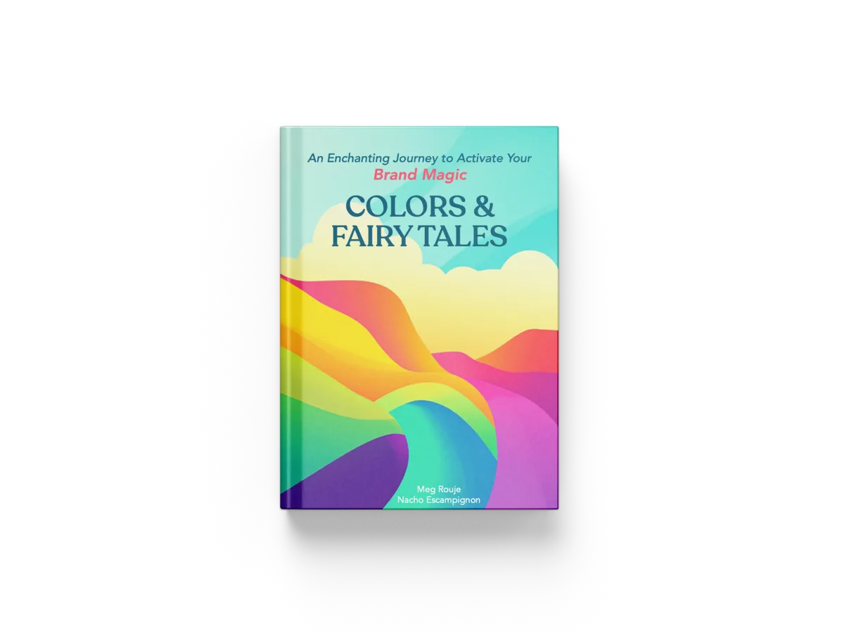
€ 33
Digital · Immediate access · Reusable as your brand evolves
Faster, more confident decision-making across the business
A more immersive & coherent brand experience across every touchpoint
Stronger psychological and emotional impact
More efficient teams and smoother execution
What people say.
Thank you so much for your support and love! This interview was so much more easy than anything I've done for the public before. Because of your help! I knew how to speak confidently. I knew what to wear based on the branding. All I have to say is thank you! You are the best!

Omg Meg! The way you sense and feel for colors and use them for an immersive experience - wow wow wow! But also, the way you teach and connect concepts — maybe with your book, I’ll finally get a bit of feel for colors!

Meg is very knowledgeable and has helped me to clear my focus and resolve some doubts I had about colour and Instagram. After our call I was full of ideas on how to make my brand stand out more.

I used to think I was really bad with colors until I met you! Well, I could still be really bad at it, but at least now I choose based on feelings more—I choose colors confidently.
Fascinating! I love how you have brilliantly integrated archetype psychology into a super accurate model to help others (myself included) with the misguided idea of branding and what truly entails!

I am happily engaging my entertainer and explorer archetypes as I write about my new offer! I am having a blast! Ideas, colors, words and more are free flowing like never before! Thank you so much!

Let your brand be FELT.
Intentionally.
Because it deserves to be memorable.

Have questions?
Frequently Asked Questions
Do I need design or branding experience?
No. The book guides your thinking step by step, whether you’re starting from scratch or refining an existing brand.
Will I get a finished color palette?
Yes. But more importantly, you’ll understand why those colors work and how to apply them consistently across your brand. You won't have a color palette, you'll have a system to help you apply those colors (combinations, proportions, ratios...)
How will this actually help me make decisions faster?
Instead of relying on taste or guesswork, you build a clear sensory and visual framework that guides your choices.
This means:
• You don’t start from zero every time
• You don’t need to test multiple options to “see what works”
• You recognize what fits your brand immediately
• You already know what materials, lighting, textures, or atmosphere align with your brand.
For example:
- choosing towels, fabrics, or furniture without second-guessing
- selecting lighting that instantly matches the mood you want to create
- deciding on colors, props, or styling for a shoot without testing multiple options
You’re not figuring it out each time.
You’re applying a system.
So decisions become quicker, more consistent, and far less mentally exhausting.
Can this help me create a consistent brand across everything, not just visuals?
Yes. The approach is designed to extend beyond graphics into spaces, materials, and communication, so your brand feels coherent across all touchpoints.
My brand already looks good. Will this still be useful?
Yes. This focuses on depth and perception, not just aesthetics—helping your brand become more memorable and impactful, not just visually pleasing.
Will I need to rebrand?
No. This is not about starting over, unless you choose to.
It helps you refine and strengthen what already exists, so your brand becomes more consistent, intentional, and easier to apply across everything you do.
Is this relevant if my brand only exists online?
Yes. Even if your brand lives primarily online, the system helps you create consistency, stronger impact, and clearer direction across all your visuals and content. Because even in front of a screen, our perception of the world is not only visual, it's multi-sensorial.
Is this relevant if my brand exists offline (spaces, products, experiences)?
Absolutely. This is perfect for brands that go beyond screens and need to feel consistent in real-world environments.
I work in branding or marketing. Can I use this with my clients?
Of course! The framework can be applied to client work to create clearer direction, faster decision-making, and more consistent brand experiences across projects.
Can this be used with a team?
Yes. The book is designed with practical exercises, so you can go through them together, like a workshop. The system you build can be shared, making it easier to align decisions, reduce confusion, and speed up execution across teams.
Ready to build a brand that is FELT not just seen?
Join Nacho now for an unforgettable adventure!
Color & Brand Strategist for Sensory Experiences - Copyright @Meg Rouje 2026